Brand identity
The Branding of a company is very important and it gives the first impression to potential clients. The design of the brand should be memorable and attractive. A professional brand or logo promotes and enhances a business or organisation. The mixture of a good product and a killer brand can make for a powerful combination.
A logo does not sell directly, it identi es. A logo is rarely a description of a business. A logo derives meaning from the thing it symbolizes, not the other way round. A logo is less important than the product it signi es, what it represents is more important. The subject matter of a logo can be almost anything.”
(Paul rand-design, form, chaos)
Flamepoint concept
The Flame point concept for state of the art fire safety equipment. The logo is simple yet strong in it’s visual appearance. The use of bold geometric shapes and the lowercase typographic element work in harmony all adding to the overall brand.
Chai concept
I wanted to create a very authentic feel promoting an organic/ rustic look. I wanted the logo to have had drawn qualities to reflect the brand. The chinese text is actually the translation for tea which also with the c before it resembles the word chai, which is the name of the brand.
Fruit diaries concept
The fruit diaries concept is an online healthy eating blog. The brand uses a very vivid yet calming colour pallete which compliments the logo well. The logo style is cartoonish and uses flat design elements to enhance it’s simple yet recognisable image.
Harvester identity manual
Right: Examples of some of the pages of a brand identity manual I created for a re-branding of the Harvester restaurant chain. It contains everything from logo usage, colour schemes, typography, image use, overall feel and implementation of the brand.
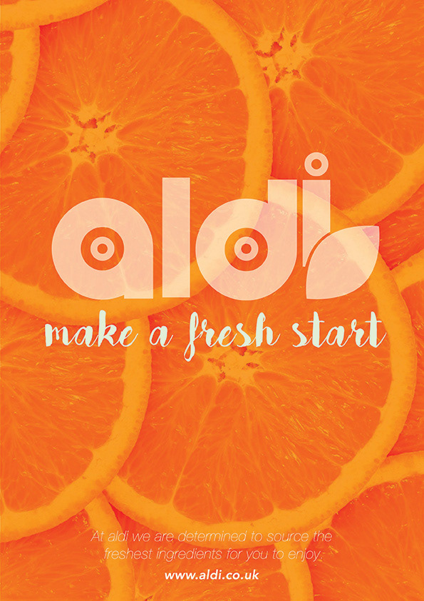
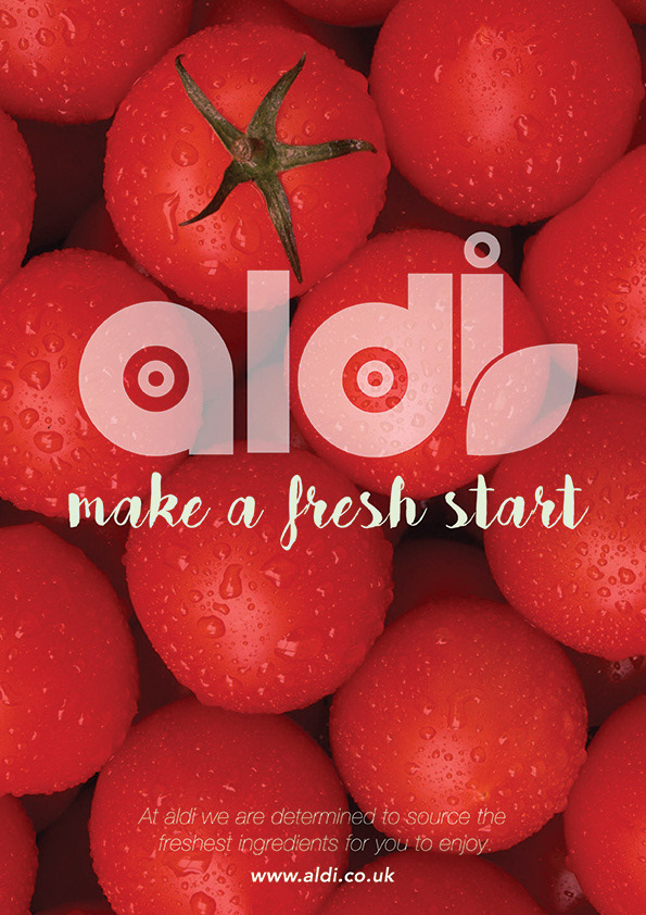
Aldi rebrand
A re-branding of the supermarket Aldi. I wanted this to be fresh and simple. I used large images of fresh produce to reflect a new approach for the store. The logo itself is very simple and uses a circular grid.


Tauro wines concept
Right: Concept for Tauro wines. The logo incorporates a geometric bull . I utilized the negative space to incorporate a sword as a homage to the bull fighters of Spain. The fluid typography gives an aesthetic tension against the geometric pictograph.
Lightbox
Light box is a logo I made for myself to promote thee paper layered shade boxes I make. I may or may not incorporate it to my brand
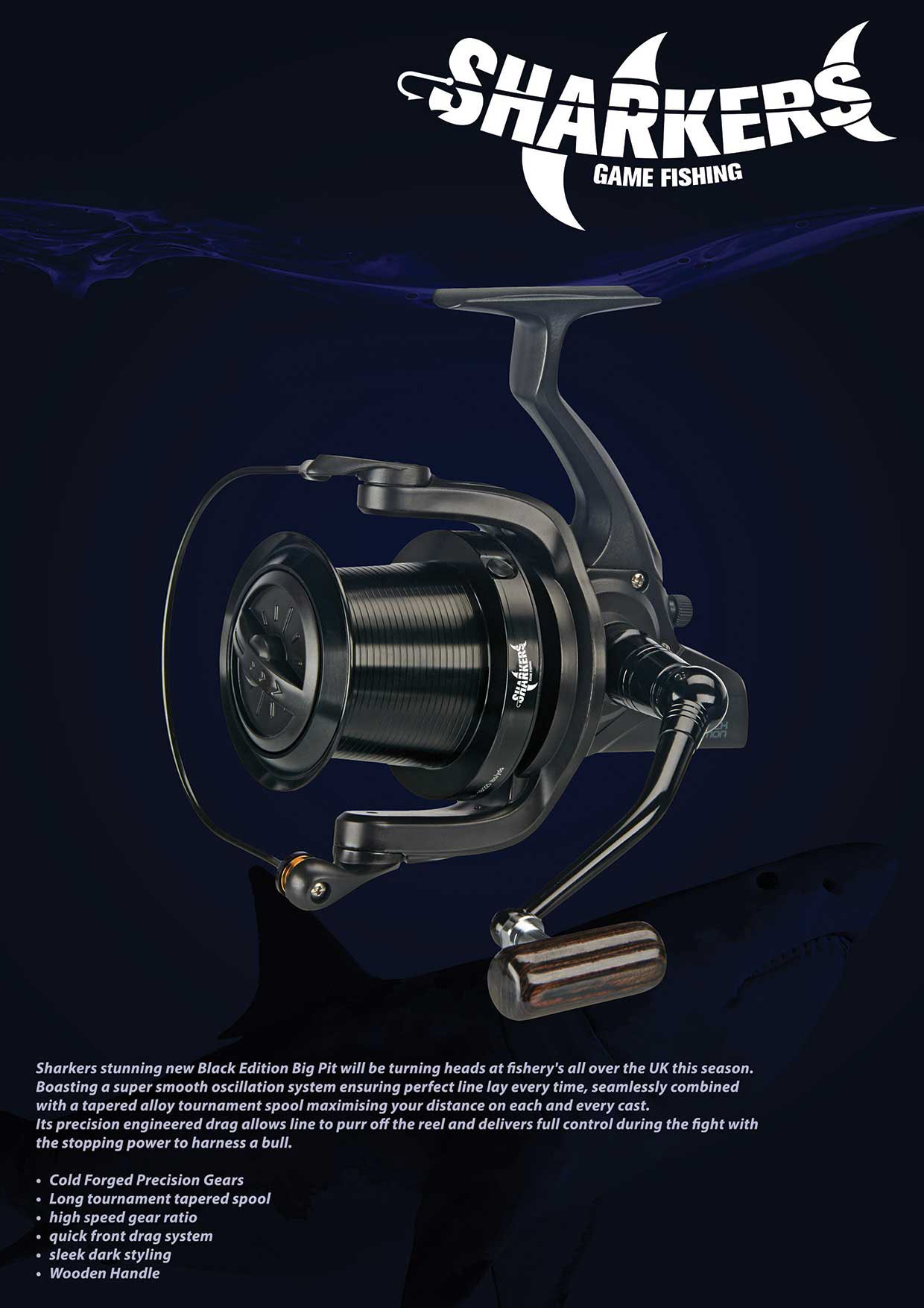
Sharkers concept
Far right: This is for a fishing company
concept that deals with equipment and clothing. The logo is very playful and acts as both pictographic and typographic.
concept that deals with equipment and clothing. The logo is very playful and acts as both pictographic and typographic.


Murk'd album cover
Album cover for up and coming band Murk'd. Murk'd are an industrial metal band who's members I have known for years. I created their album art and logo. The logo was based on a Sri Lankan mask that one of the members has.