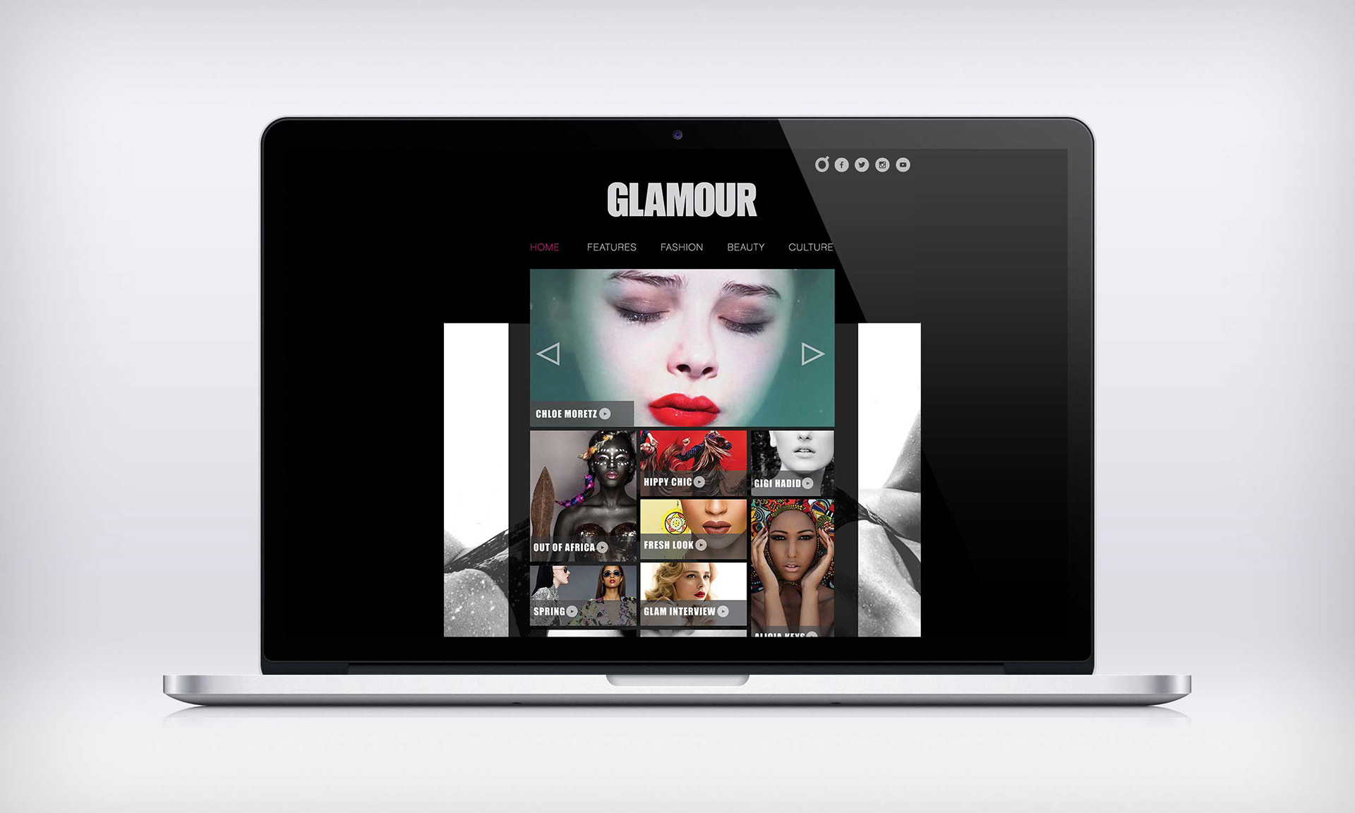
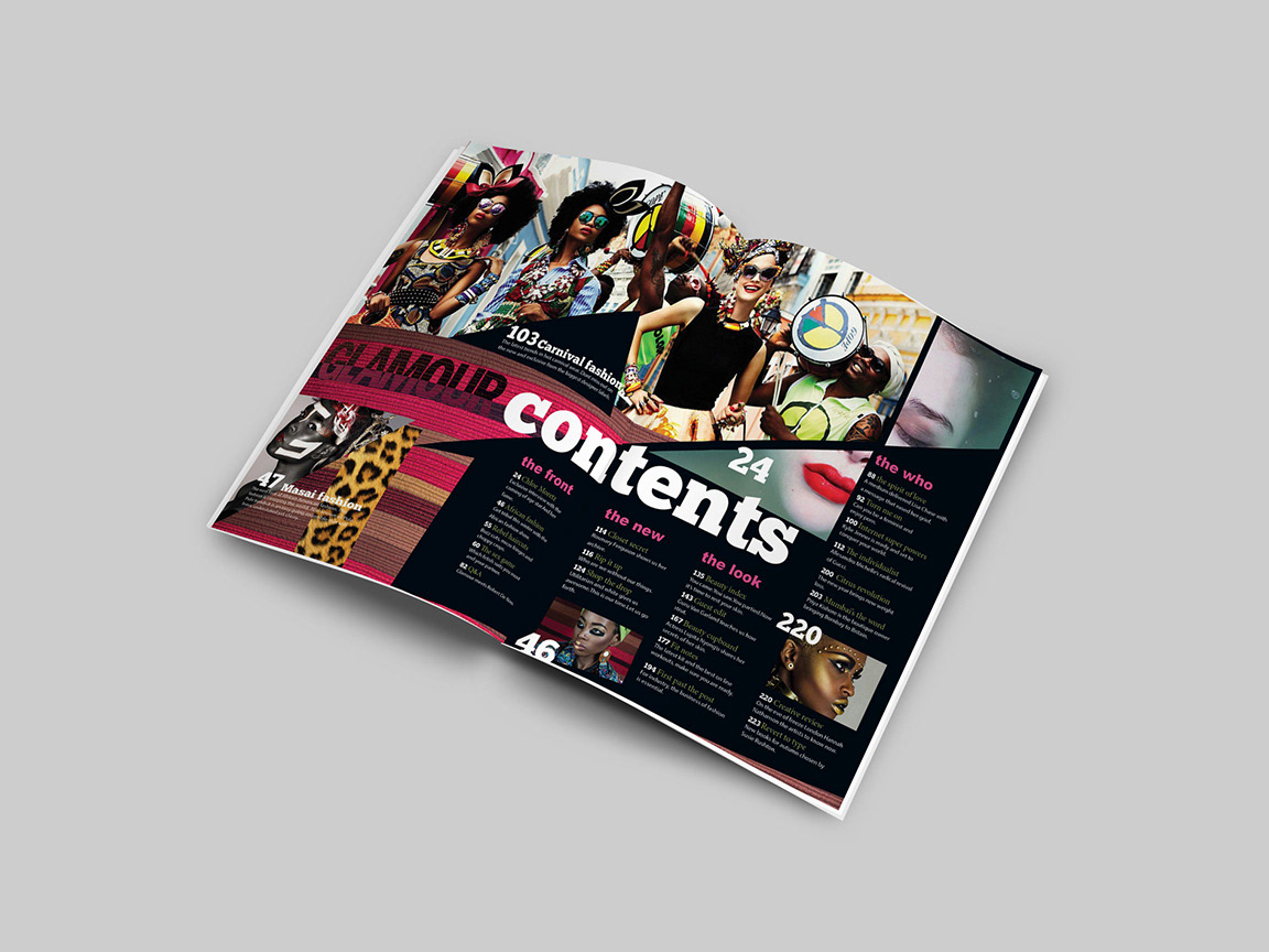
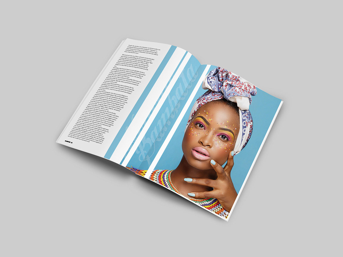
Editorial design
Glamour
Glamour magazine out of the three is much more well established, it’s first issue was in 1939 and has world wide recognition. Because of this I did not want to change the masthead too much but I wanted to incorporate my own style. I would go on to design three Glamour variations which included a special “African fashion edition”, A subscribers edition and a more traditional edition. The first 2 would be very minimal in style and would only have a single cover line, where as the traditional would have more cover lines especially on the left third in order to attract people. Personally I prefer the minimal covers for aesthetic reasons.
![](https://pro2-bar-s3-cdn-cf2.myportfolio.com/95f07236108a89cd2d9af92cc30ed265/399c9171-5dd5-4fcc-bff9-a16af5cd4a81_rw_1200.jpg?h=c98dc02b90a6d7711aaddee05f95c0c7)
![](https://pro2-bar-s3-cdn-cf6.myportfolio.com/95f07236108a89cd2d9af92cc30ed265/08b05ec7-d92b-4f2b-ae7e-d2d0e73c71ba_rw_1200.jpg?h=3400641026698a78893a6a39d73ef98d)
![](https://pro2-bar-s3-cdn-cf6.myportfolio.com/95f07236108a89cd2d9af92cc30ed265/a007d021-55eb-4d7d-a79e-489ae9495dc8_rw_1200.jpg?h=72767046c5fad88e3f900397ddb57192)
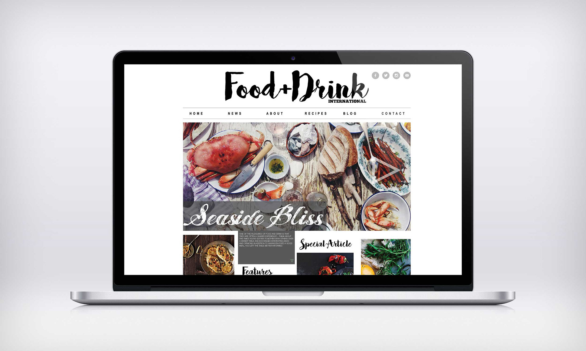
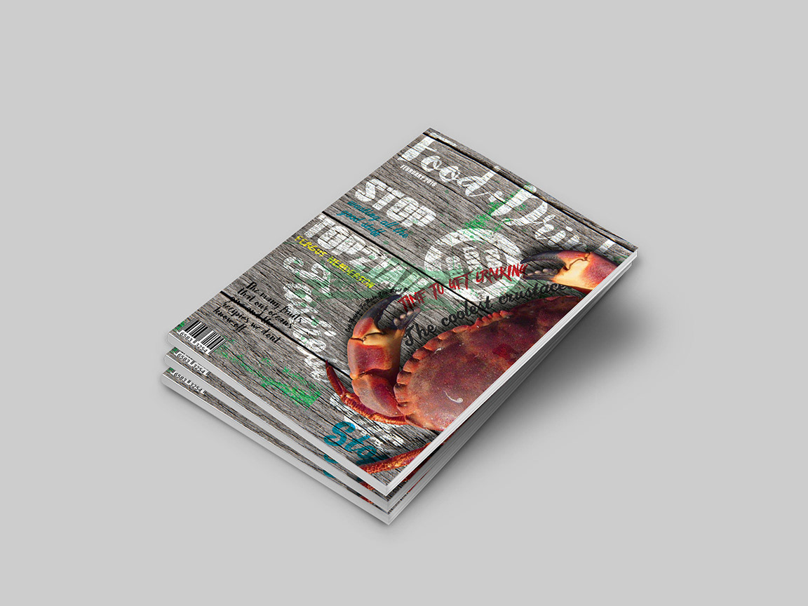
Food & Drink International
Food and Drink has 495,000+ readers most of whom are CEOs, presidents, vice presidents, plant managers and other top executives. When researching the magazine I found it’s contents to be very sterile and some what cold. I decided to re brand the magazine in order to attract more readers and to maintain the existing ones. This facelift would merge two types of publication and create a warmer more populist magazine for the foodie, the chefs and managers who come from the industry. For this magazine I created two full versions and three extra covers.
![](https://pro2-bar-s3-cdn-cf.myportfolio.com/95f07236108a89cd2d9af92cc30ed265/b9c4d6ef-b0dd-49c3-bfc1-4f0fb43d9b56_rw_1200.jpg?h=3f351460496930e975fa7f38aafafab1)
![](https://pro2-bar-s3-cdn-cf2.myportfolio.com/95f07236108a89cd2d9af92cc30ed265/d93ab3a2-6638-41c7-972e-2175458e8426_rw_1200.jpg?h=824392e59e39610ab6ebbba5bb4fac69)
![](https://pro2-bar-s3-cdn-cf2.myportfolio.com/95f07236108a89cd2d9af92cc30ed265/33377d26-fe08-4dca-af02-a99e4bd9f55a_rw_1200.jpg?h=51d1aacbafebb6654b99cad58c46654e)
![](https://pro2-bar-s3-cdn-cf2.myportfolio.com/95f07236108a89cd2d9af92cc30ed265/34f86f52-e989-44bb-b5eb-847c76b4e0d4_rw_1200.jpg?h=1a0b6ae29c97e06fe5e4714b753b5271)
![](https://pro2-bar-s3-cdn-cf1.myportfolio.com/95f07236108a89cd2d9af92cc30ed265/91cc8382-b003-415f-a077-1c3d7e20c188_rw_1200.jpg?h=2b7fcce2b288dd84eca9bf2c10e9f40c)
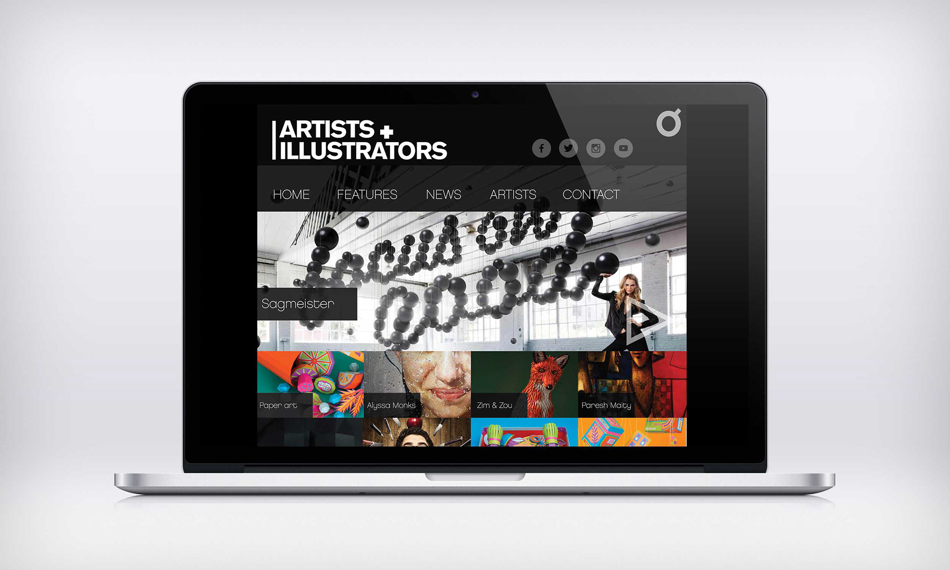
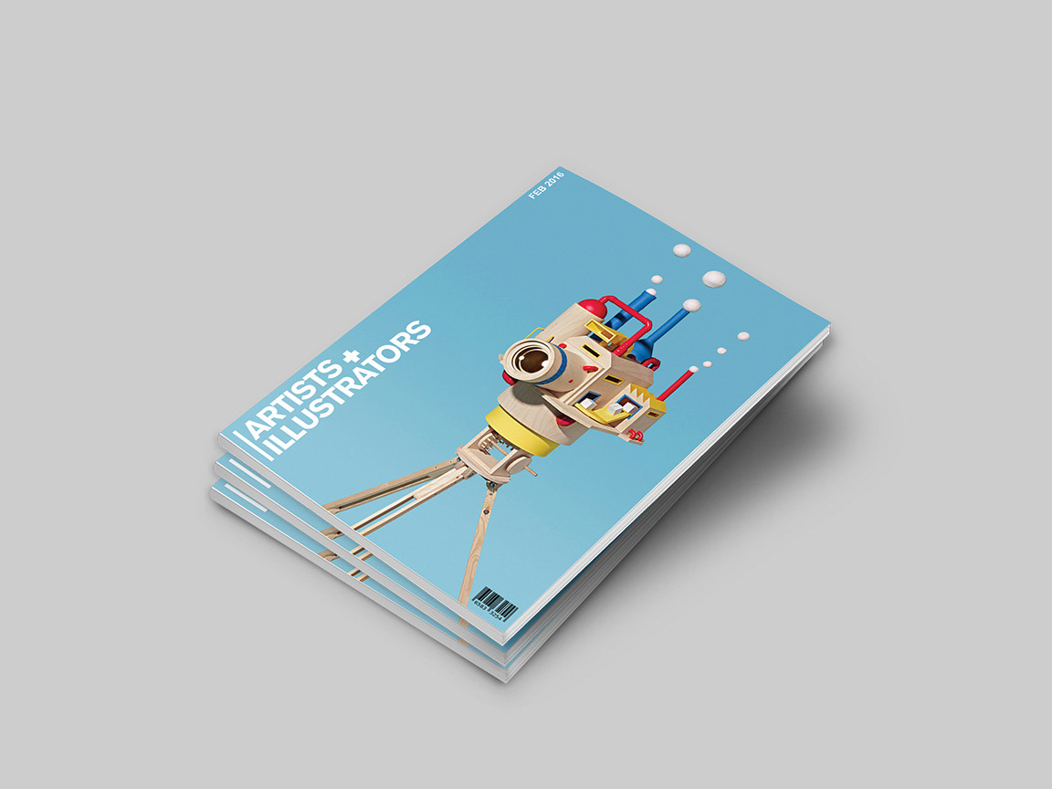
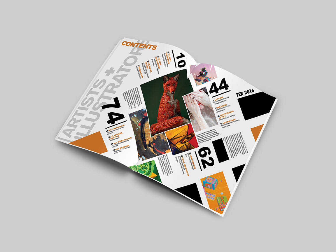
Artists & illustrators
Artist and illustrator is the U.K’s number 1 magazine for original art.” When looking at the magazine I found it to be very well structured and had a clean, crisp feel. The masthead though felt a bit outdated and the over all design was dull, so I decided to also re brand this publication and bring it up to date by using a Swiss design approach with almost no over ornamentation. To achieve this I first changed the masthead from a serif to sans serif, this I felt bought more clarity and functionality to the brand.
![](https://pro2-bar-s3-cdn-cf4.myportfolio.com/95f07236108a89cd2d9af92cc30ed265/5a3bcc53-7a74-4177-b6e0-4dcc7f3845ae_rw_1200.jpg?h=9e14bcbf99cb38246bf0c21898904936)
![](https://pro2-bar-s3-cdn-cf.myportfolio.com/95f07236108a89cd2d9af92cc30ed265/10432454-3c05-4451-a669-914dc29e4af0_rw_1200.jpg?h=9dfd291d6b461d5de3cec6e5781048ff)
Web
![](https://pro2-bar-s3-cdn-cf.myportfolio.com/95f07236108a89cd2d9af92cc30ed265/13bebf33-c791-430a-b596-50f30b180528_rw_1920.jpg?h=81cc309025237b381b4228cf22de6705)
![](https://pro2-bar-s3-cdn-cf2.myportfolio.com/95f07236108a89cd2d9af92cc30ed265/da439fe3-42b8-4103-a133-7d63d229fe07_rw_1920.jpg?h=646ed4dfb04a9a5cd4450447c416c787)
![](https://pro2-bar-s3-cdn-cf4.myportfolio.com/95f07236108a89cd2d9af92cc30ed265/f8a00259-9c19-4ce5-aa14-d61aa18a958b_rw_1920.jpg?h=1cdfec8e9fc3b276269450c22251a812)